
Editor’s note: This article was originally published on April 1, 2020 and has since been updated, with the most recent changes made on Aug. 6, 2022. Data visualizations are updated on a recurring basis.
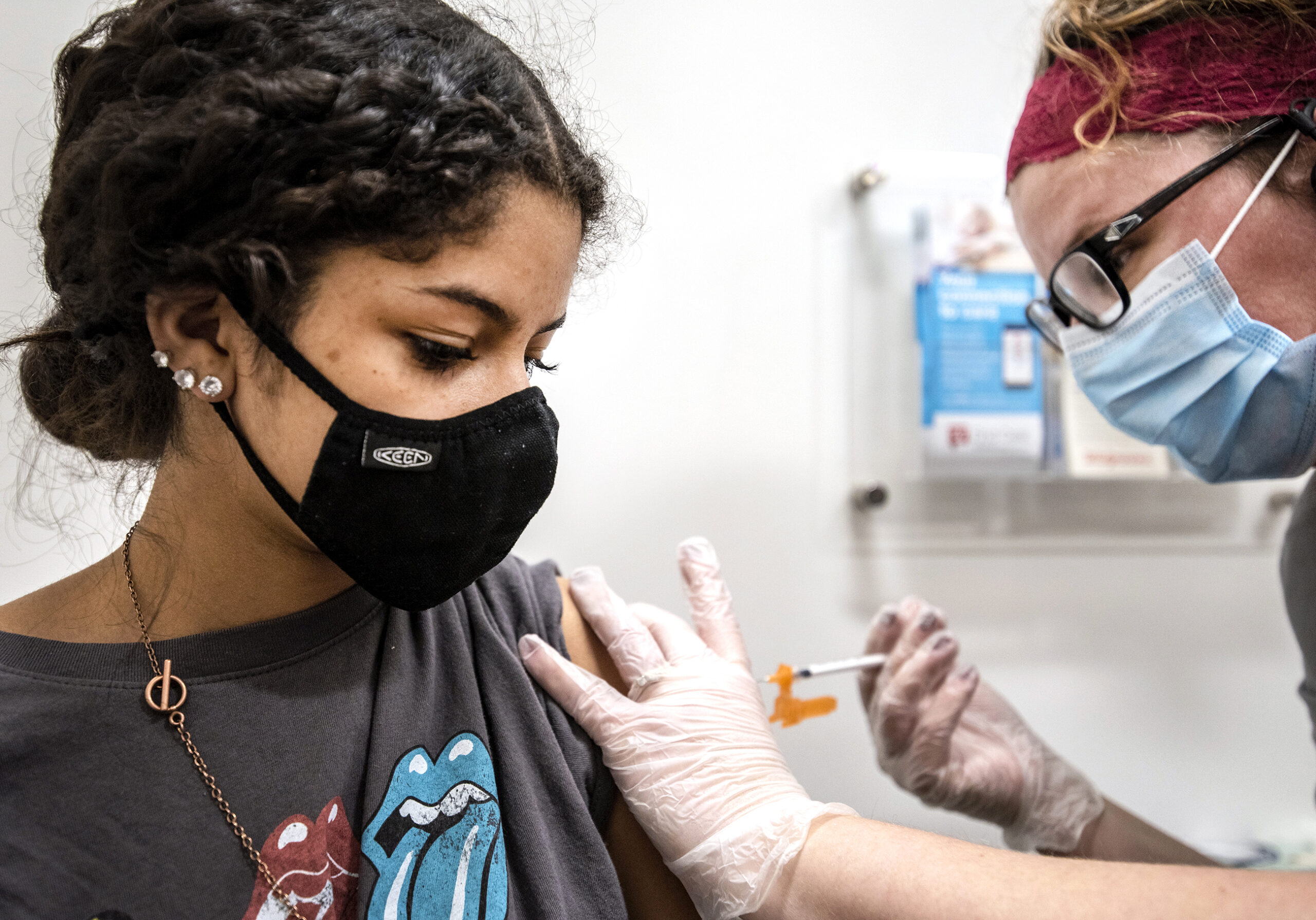
Following its emergence, the COVID-19 pandemic struck Wisconsin in a series of waves with varying degrees of intensity that has peaked multiple times. Click on the table of contents or swipe the page to view a series of visualizations that depict the impacts of COVID-19 across the state.
News with a little more humanity
WPR’s “Wisconsin Today” newsletter keeps you connected to the state you love without feeling overwhelmed. No paywall. No agenda. No corporate filter.

This report was produced in a partnership between Wisconsin Public Radio, PBS Wisconsin and the University of Wisconsin Cooperative Extension. @ Copyright 2026, Board of Regents of the University of Wisconsin System and Wisconsin Educational Communications Board.